


13 tips for creating a successful intranet page

Jonathan Davies

See how an intranet works
Learn how an intranet works with this short video.
 17 mins read
Sun, Aug 22, '21
The usefulness of an intranet solution is determined by its users. That’s why researching within your organization to find out what content you employees need will help you build a successful intranet.
Though every organization has its own specific needs, some general tips can help you build more relevant intranet landing pages for your employees.
What is an intranet landing page?
An intranet landing page is the first page employees see on the intranet. It’s the essential hub for workplace information that highlights company news, updates, important documents, work groups, applications and KPIs that allows employees to find what they need.
In addition to an intranet homepage, intranets can have key landing pages such as department pages. Landing pages that are relevant for the user have a higher intranet adoption rate, so knowing your user and their needs should be a priority.
What makes a good intranet page?
The best intranet pages are the ones that are well designed and helpful for the user. Successful intranet pages make the life of employees easier by centralizing information. But exactly how do they do it? We collected some of the most important tips for intranet landing page design for you to create some slick intranet pages.
Want to see an intranet in action?
Watch video
13 tips to create intranet landing pages that your employees will love
- Design for the best User Experience (UX)
The more effective UX elements are, the higher the chance that users stay on the page or return in the future. By following the UX best practices like keeping pages simple and including CTAs, designers can create intranet landing pages that employees love.
During our second podcast episode, Dan Williams - Senior UX Designer at Within Reach Group - said: “UX isn’t an art form, or an exact science. It’s more about the method. The biggest thing you’ll learn in UX is just to try things. If you have to test two versions of a page, just put it out there. Learn from it, change if it isn’t working.” Create, test, optimize, repeat. Don’t assume something will work. The desired end result shouldn’t be “to deliver a beautiful intranet page”. It should be “to deliver an intranet page that everyone wants to use” – and you can only do that if the page is relevant.
- Don’t bury the lead
Starting with the most relevant content means you won’t “bury the lead”. This news-centered approach proves that modern writing doesn’t rely on modern studies only. Chip and Dan Heath explain this well in their book “Made to Stick”. Start with the most important point, then use the information below it to build on that point at the top. In terms of a post, here’s what that would look like:
- The lead
- Important fact 1
- Important fact 2
- Supporting quotes
- Anecdotal information/end
While most of your intranet pages are unlikely to use quotes, the concept remains the same. Start with the most important thing, then make sure you engage people enough so they continue to scroll down.
- Clear hierarchy of text
Words are words, images are images, right? Well, not entirely. We still read with our eyes, so the way text looks has a big impact on how our brain tries to comprehend information. By clearly and consistently differentiating headers from sub-headers, and intro paragraphs from normal paragraphs, the reader doesn’t need as much brain power to understand what you’re saying on a page. Take this blog post for example! There’s only one big header, indicating that’s the main title. All other sub-titles are smaller, but are still clearly titles. Paragraph text is consistently the same size throughout, too, making scanning for headlines easier. Remember: what’s relevant is what counts the most, so if you want to help your people to scan read, use descriptive and clear sub-headers.
- Information design
By sticking to a constant, templated intranet page layout, the brain can absorb information more easily because it knows what to expect in certain parts of the screen.
Of course, this rule can be broken too. If it’s done by way of exception rather than the rule, it becomes easier to make key information stand out, even if it’s not at the top of the page.
- Don’t be afraid
“Don’t fear white space. It’s used to guide focus and highlight structured information, making it easier to digest.” - Stefka Ivanova, Creative Lead at Happeo
Stefka’s point is something we’ve all encountered in the past. On one hand you have limited real estate to communicate what you need, on the other you need to make your message stick. White space is easily detectable as “the same”, so our brain quickly directs our attention towards something more interesting. When “everything” is interesting, our brain can’t filter anymore. This is a core principle behind Gestaltism, a stream of psychology that famously brought forth the term “the whole is something else than the sum of its parts” – often incorrectly translated into “the whole is greater than the sum of its parts”.
- Good ol’ Table of Contents
A tip that’s most suitable for pages with a large amount of information, a table of contents is particularly helpful for recurring visitors. For instance, if you have a dedicated onboarding page, you’ll have a large variety of information. Basic contact details, company-specific reading-material, forms to fill in, maybe even evaluation-report templates to download – you name it. Since you can’t be onboarded in one day, it’d be quite helpful for people to be able to revisit what they need to do to become a real part of your company. If they have to swim through an ocean of irrelevant information before they get there, chances are they won’t take their onboarding process seriously.
Discover all the features of an intranet software
Download feature list
- Power of imagery
“A picture says more than a thousand words”. Notice how that’s always something you read, never something you can literally distill from one image? Images are incredibly powerful, memorable and often better at communicating complex information in a way that makes it easier to distill. But if we’re talking about just a picture, you’re leaving your information open to interpretation. That’s why the combination between imagery and words is so strong. A few ways you can use imagery are:
Make information memorable through metaphors. For example, if you’ve created a page about career development within your company, an image of crossroads relates nicely. Subsequent pages on career development can then use that same image, making sections easier to identify without having re-read.
- Direct attention to a specific section of a page. For example, a photograph of a model looking to the top right – a place where you can conveniently place a widget, table or other key information
- To reinforce your (employer) brand. As much as we all love Unsplash, make sure you don’t go crazy with stock imagery. Pictures that are unique to your company are far more powerful and recognizable.
- Don’t make me think
We’ve spent a great deal of time on effective writing on an intranet already, so we won’t repeat ourselves too much. The main point is this: writing for an online medium is different than writing for an offline medium – so too for an intranet. Avoid:
- Overuse of adjectives
- Formal language
- Implicit information
Your end goal usually involves getting the reader to perform an action, so make sure the information on the page doesn’t take away from that.
- Clear Call to Action (CTA)
When it comes to a good CTA, it’s recommended to be as descriptive as possible. Instead of directing people to a section on your social intranet with a hyperlink or button that says “more information”, replace that text with something that communicates the benefit to the person clicking. “More information” could then change into “Click here to get ___”. Remember, the less you make someone think, the more motivated they’ll be to do something. Some other best practices for CTAs are:
- Place CTAs at the top and bottom of the page
- The message in the CTA and the heading of the landing page should correspond
- The content of the text should reflect what you’ve promised in your CTA — and vice versa
- Colors matter: contrasting colors perform best
- Button shapes play a big role: test and see which shapes work best on your pages
- Create a Sense Of Urgency by adding words like “now” and “today”
- Personalized content
Especially in a larger organization, your intranet software will have multiple different user groups. Besides company wide news, it’s important that your employees can follow updates from topics that are especially relevant to them. Targeting can be done for example based on the location, function or by project.
- Integrate your business toolset
It’s understandable that you want to highlight important internal news on your intranet landing page – just remember that a page dominated by generic content might not feel relevant enough for your employees. One great way to make your intranet page more appealing is by integrating the business tools that are used on a daily basis, such as the calendar and virtual collaboration spaces. Features that enable collaboration and enhance productivity turn your office intranet solution into a portal that does not only keep your employees informed but also supports their actual work.
- Interactive news
Get your people involved! Engage your employees with your internal communications by giving the opportunity to interact with your intranet news posts by liking, commenting and tagging colleagues. This is a simple step towards a two-way communication structure with your employees. You can instantly get feedback from your audience on which topics they are interested in, then commenting gives them an opportunity to ask questions and share additional knowledge related to the news piece. Dialogue drives engagement and will help you create a healthy culture where discussion and knowledge sharing is encouraged.
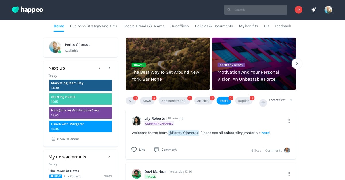
Intranet landing page example
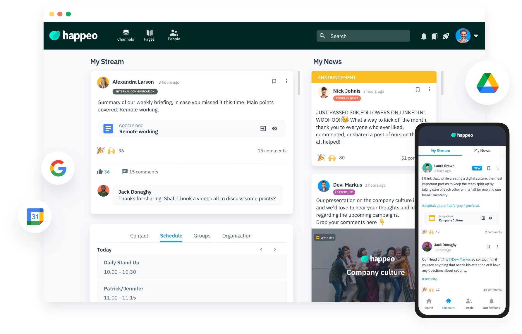
Why this is a good example
This intranet landing page is good example of how it should be done. The page has a minimalistic look, presenting information in a clean way, reducing images and text to the most important ones and using enough whitespace. The most important company news is positioned on top of the page. This ensures employees keep up to date with important information, announcements, events or other changes.
The intranet page design is inspiring and motivating, showing the calendar and using social features like commenting and videos. There are clear navigation links for categories like “Channels”, “Pages” and “People”, as well as a search bar, which helps employees to quickly find what they are looking for.
By branding the intranet pages, you can choose a name that fits your company and add a unique look and feel.
Want to see how Happeo helps your business?
Book a demo
Are you using the right intranet software?
Does everything I've mentioned above sound out of reach for you? Perhaps you're not using the right intranet software. Take a look at the free Intranet Comparison Guide for more information on the types of intranet tools that exist, and which one would suit you depending on your business needs or book a demo with Happeo. We can help you improve employee engagement, internal communications, and even productivity.